


Simpplr was purpose-built to connect, align, and engage the workforce. Many of our customers seek advice and best practices on how to build their intranet dashboard to be engaging and effective.
Here is the perspective from our lead designer, Brendan Patterson.
“I wanted to pull together some guidelines for what I believe are the best practices for app (home) dashboards with the goal to maximize adoption and engagement for our customers. I’ve referenced generic UX best practices and UX studies with some personal opinions based on over 8 years of UX experience. Hopefully, this is useful and can be used to help persuade some customers who are on the fence about things like the feed or simply unsure what they should do.”
Best Practices for creating an intranet dashboard experience
Dashboard goals
The dashboard is easily the most important aspect in the intranet, let alone in Simpplr. It’s the gateway into the intranet and holds a lot of responsibility. As the majority of organizations use app manager-controlled dashboards, it’s essential that these are configured to perform efficiently. It’s important to remember a dashboard should be configured to add maximum benefit to the end-user and not from the point of the organization. If you provide value to the end-user they will adopt and engage with the platform, which ultimately benefits the organization as a whole.
There are numerous features and integrations in Simpplr, but the primary objective and unique selling proposition of Simpplr’s intranet is to create, publish and distribute content to connect, align, and engage the organization.
Content
Content in Simpplr falls largely into two types: ‘News’ (announcements, information) and ‘Knowledge’ (Documents, policies, resources, files). News content is time-sensitive and becomes less relevant the older it gets. Knowledge content should be relevant and accurate for the duration of its lifespan.
There is a critical difference in the way these types of intranet content are consumed. It’s unlikely that a user will search for news because you are unlikely to be aware that it exists in the first place. This is known as an ‘unknown item’. However, users are likely to search for knowledge content provided that the platform demonstrates that it’s likely to provide those items. This is known as ‘known item searching’. (This is a similar concept to why the hamburger menu is a UX failure for the majority of apps/sites which use it).
Here’s one way to think about user experience:
“The core principles of web navigation are similar to those of wayfinding and signage in the physical world: clarity, visibility, and obviousness matter. If you’re driving down the freeway, for example, you’ll generally see lots of highly-visible signs giving you updates on distances, reminders about upcoming off-ramps, speed limit signs, turns, possible dangers, etc. Now imagine if all those signs were hidden by default and that you had to push a button in your car to see them.”
It would be dangerous for drivers because they are forced to commit other actions that cause them to lose focus of their primary objective. The same applies to the context of intranets.
Content Best Practices
Here are some content best practices that will help focus and engage your employees:
- Concentrate on adding from the user point of view (not the organization)
- New, relevant engaging content drives adoption
- ‘News’ content must be presented to the user
- ‘Knowledge’ items should be browsable or searchable
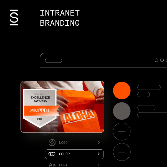
Branding (backgrounds)
The reason we have a different (gray by default) background color in the Simpplr is to differentiate and separate sections or tiles. Keeping the contrast between the background and the page elements is very deliberate. Low contrast increases readability and helps keep the focus on the primary content. You’ll see this in most mainstream apps, even those with ‘dark mode’ will use a secondary, complementary color with low contrast.
When a background image or color (other than default) is selected, it’s necessary to move components like the feed into a panel to ensure readability and contrast is maintained.
Branding Best Practices
- Use the default gray (#f6f6f6) for maximum readability
- Don’t use background images
Carousel
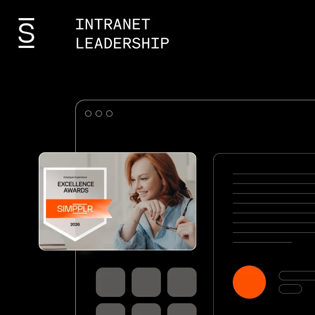
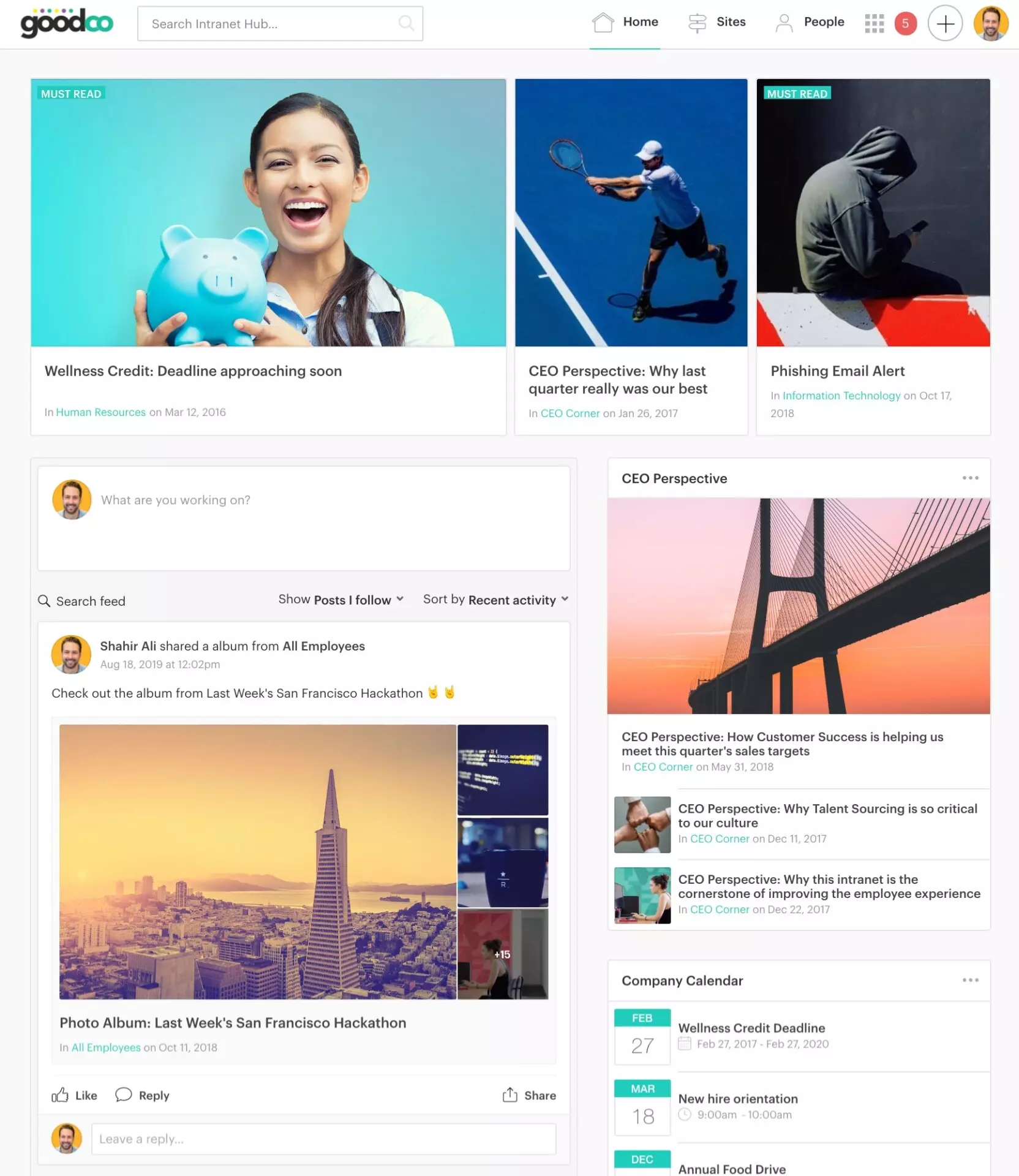
The carousel is the primary source of ‘content’ for most app users and is responsible for a high percentage of click-throughs. To maximize effectiveness and encourage readership and engagement, the carousel should always be full-width. Fitts law means that users will expect this to be the primary and most important item on the page.
“The time to acquire a target is a function of the distance to and size of the target.”
The carousel should also be set to ‘Showcase’ layout to maximize the exposure of content. The carousel is one of the only places in the app where less is not more. Users have a very small attention span (8-10 seconds) and are unlikely to paginate the carousel. Interestingly because of a concept called ‘Banner blindness,’ users have become conditioned to ignore large sliders (carousels) and banners as they usually contain advertising or irrelevant content. So it’s important to increase the selection of content from one to three. Changing the visual appearance creates a significant advantage in readership.
To demonstrate the impact of the carousel on the page, try ‘the squint test’ – squint at the page so that all of the components are blurry and you can’t make out the details. The size and boldness of the blocks should correlate directly with how important it is. When there are three slides (showcase) vs. one slide, they look very similar in the squint test so no importance is lost in the visual hierarchy.
Carousel best practices
- Use a dashboard layout which displays the carousel full width
- Use showcase layout to increase impressions 3x
- Regularly update with new content
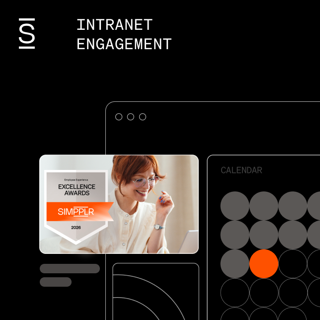
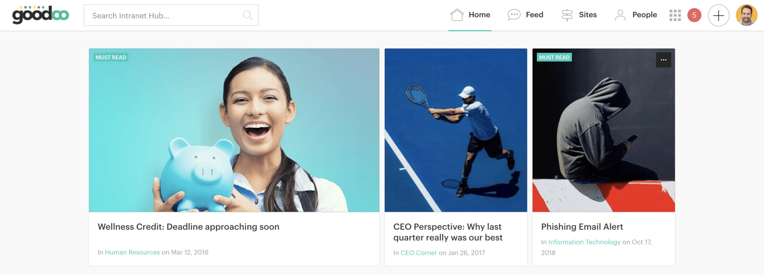
Feed
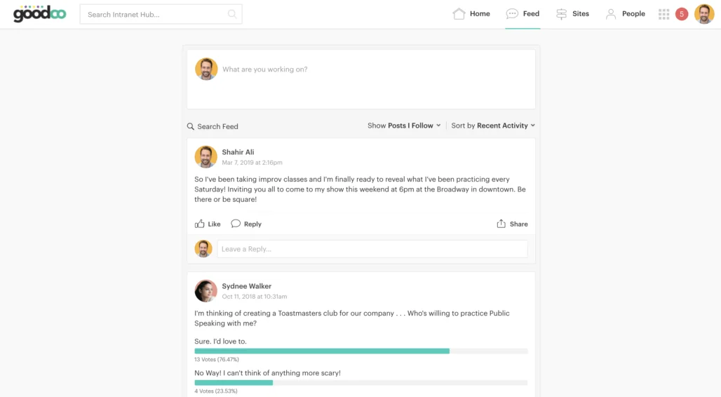
The feed is great for collaboration, engagement, and social activities but it serves as more than that. Because of the nature of the feed, it’s likely to be constantly updated with new comments and posts. This ensures that there is always something new for users to see when visiting the app, which is critical for retaining users (remember, out of sight is out of mind).
The changes made in Summer 19 now builds on top of that foundation. As content is published, it should be posted in the feed, turning the feed into a content discovery mechanism which is timely, personalized and self-regulated. Content authors can now do their bit to promote healthy engagement in the app without relying on the carousel or tiles to be manually curated.
Comments are now grouped together, providing a clearer understanding of why you see the items you see, with more emphasis on the content. Utilizing these features transforms the feed from a social tool to an entire ecosystem of latest and trending content.
Feed best practices
- Display the feed on a dashboard (Ideally left column)
- Utilize the ‘Promote’ content flow and share to feed
- Show ‘All posts’ and sort by ‘Recent activity’ for smaller organizations
Layouts (Columns)
There are a number of layout options available within the app, with or without the feed, carousel position, number of columns, the width of columns (if the feed is not on the dashboard). But there are some things to consider.
Users are pre-programmed to expect the most important content to be at the top of the page and to read from left to right. When you introduce a large number of tiles of different heights, it can become hard to establish hierarchy. If you were to use eye-tracking studies would most likely see a user chaotically bounce around the screen as everything fights for attention.
The three-column layout is particularly vulnerable to this. Editorial sites like Pinterest made the masonry-style popular but it’s important to note they also encourage a chaotic browsing experience for the kind of media they display (images). What happens is Pinterest displays as many results as it reasonably fits on your screen and whichever image gains the user’s attention wins. And this works for imagery, but not for content.
Layout Best Practices
- Organize items hierarchically
- Prioritize items from the top left
- Keep it simple – Avoid ‘filling up’ the page with too many tiles
- Avoid using the three-column layout (if excluding the feed from dashboards)
Tiles
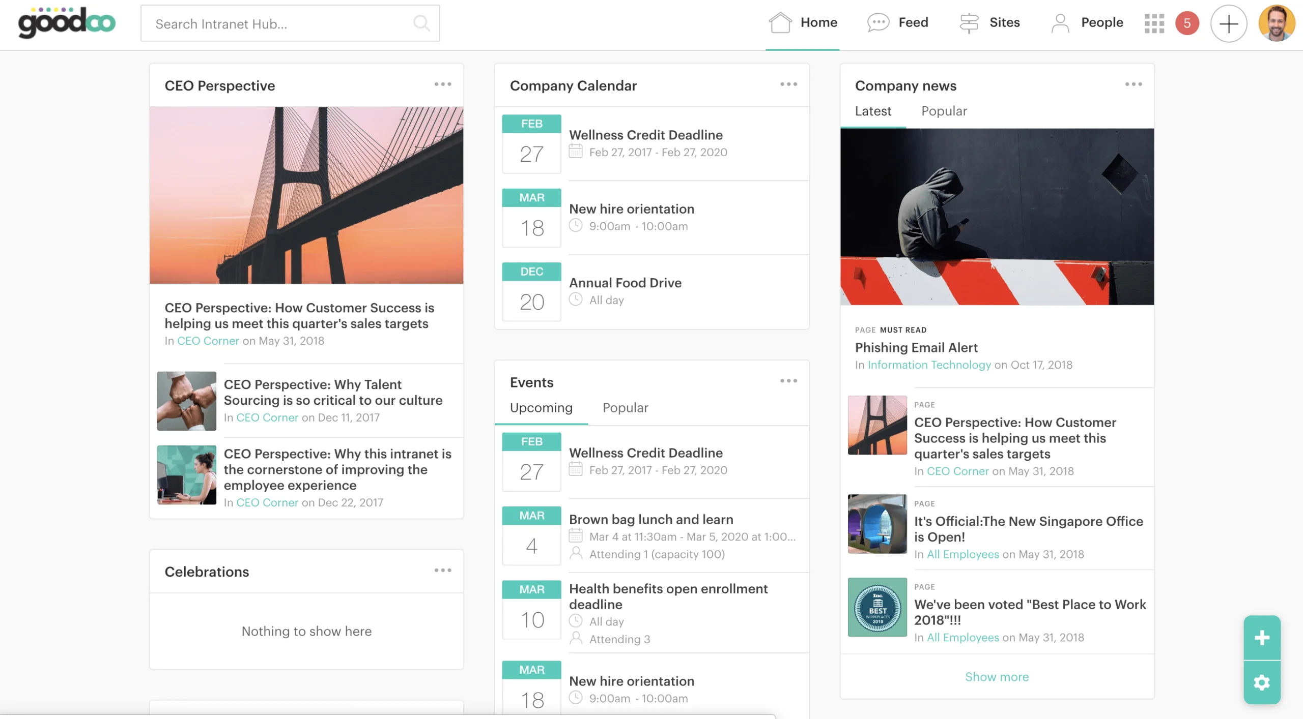
Tiles are a powerful Simpplr feature and can be used to create rich, dynamic environments for users. However, it’s important that tiles remain constrained and embrace the “less is more” philosophy. Unless the tile is dynamic (populated automatically) it’s critical that it’s regularly updated. Like an online shop, you don’t need to put all of your products and information on the homepage. Instead, set an expectation of what to expect (the feed is particularly efficient at this, highlighting users, social activity, sites and content in one single feature).
Avoid recreating site architecture like site or event listings with tiles. This wastes critical space, is unnecessary and ultimately static. Rather, make sure subscriptions have been created to limit the requirement to browse and follow sites. Sites can be reached directly from the navigation and upcoming events will appear in the (dynamic) latest content tile.
Consider the value of all tiles. Companies expect that intranets will ultimately increase productivity and business. Users expect that our product will empower them to do their job. if it doesn’t directly result in better content discovery or engagement within the intranet, it’s probably unnecessary. Stock prices, links, weather widgets, company social feeds, countdown clocks should be avoided in favor of more direct content.
Tiles Best Practices
- Less is more! And just because you can, doesn’t mean you should
- Avoid tiles that are not relevant and useful to 100% of the workforce
- Content is king (and so are dynamic content tiles)
- Avoid displaying static content in tiles
- Don’t recreate app architecture with tiles (e.g., Sites)
Best practices for creating an intranet dashboard experience summary
I hope this was useful to help you create the best intranet dashboard experience. Each dashboard component was described in detail to help you understand the guidelines. When putting the dashboard together, make sure to keep in mind these guidelines:
- Branding: Use the default header
- Branding; Use the default background color
- Layout: Include feed on the dashboard, in the left column with a full-width carousel
- Carousel: Use the showcase layout
- Tiles: Use the latest content tile (ideally the top of the right column)
- Tiles: Maximum of 3 additional tiles
If you used these guidelines to create your intranet dashboard, let us know at [email protected]! We’d love to see your intranet dashboard, and even better – the before and after.