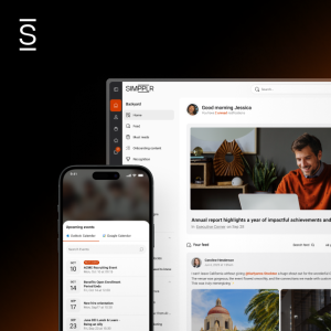
We often get asked about Simpplr’s click-path options and whether we can provide more detailed, collapsable menu structures. From what we understand, Simpplr provides the simplest and cleanest menu design options in the industry.
We emphatically defend this approach, justify it with usability research, and challenge people to rethink what intranets should look like in 2019. We’ve researched Why Intranets Fail extensively and learned that understanding user behaviors and preferences is critical for a successful intranet.
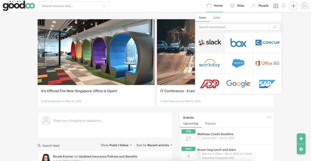
The menu is an area we research extensively!
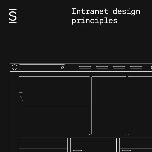
Simpplr’s intranet design principles are core to our product strategy and even part of our namesake, Simpplr (get it?). So these interactions are always top of mind. As part of Simpplr Research, we constantly validate our design philosophy.
Understand the intranet use cases
We know we’re simplifying, but to frame the conversation, understand that your users go to the intranet for a few reasons:
- To find information
- To connect with people
- To stay informed
And generally speaking, users are either consuming 1) knowledge or 2) news. This distinction is important. Breaking down these use cases help us think about the appropriate intranet design principles.
Intranet use case #1: Users use the search tool when they know what they want
This scenario is the most straightforward. Data shows (almost uniformly) that when users are searching for knowledge that they know exists, they’ll prefer to use search. Menu options are irrelevant. Think about your interactions with Amazon. If you’re buying light bulbs, you could click on Home & Kitchen > Tools & Home Improvement > Lighting. But you are likely to jump straight into search, the number and relevancy of the results you get to dictate if you need additional category filters, sorts, etc or not.
Intranet use case#2: Using search vs. promoting contextual navigation
Sometimes users are looking for information, but don’t know the specifics of what they are searching for. In this scenario, it’s significantly easier for a user to recognize and navigate contextually than guessing their way through complex menu structures which lack context and explanation.
Don’t get us wrong, there is still a place for structures in intranets! In fact, they’re critical for a user to mentally map and understand the underlying structure, but timing is everything. We’re careful to only introduce additional layers of complexity when it’s critical to the task in hand.
For example, Simpplr gives special precedence to “Featured Sites” to guide users to their content so they don’t have to navigate hundreds of others to guide them to the most meaningful content. Once a user lands in that location, we can improve the usability by adding more click paths or highlighting coworkers who can help. But providing all of this information upfront, in expansive menu structures, will overwhelm the user.
Intranet use case #3: When users just want the news, they shouldn’t have to navigate through a structure
Now that we’ve touched on the ‘knowledge’ use cases, let’s look at how users expect to stay informed and consume company news. First off, people can’t search for news if they don’t know the context. Secondly, people shouldn’t have to navigate to news through menu options. Instead, the news is usually front-and-center on their homepage. And intranet technology is improving to better personalize what’s served up to employees based on what type of employee they are. Most company news has a short shelf-life and should be appropriately archived anyway.
Intranet use case #4: Contemporary design standards are becoming simpler
If you look at design standards benchmarks across successful consumer apps and intranets you’ll notice that the emphasis should always be on simplicity and ease of use; click-paths are going by the wayside. For example, Medium, the popular blog content platform prioritizes navigation by discovery. Apple and Tesla’s sites are very clean and straightforward only revealing additional layers of navigation when you need them. There is an entire generation of people on apps such as Snapchat and Instagram who have never interacted with huge, global menu structures.
The Simpplr Intranet Design Principle: Keep things Simple!
So net-net: We purposely minimize our design interactions and have built an intranet with 2019’s end users in mind. We want the navigation to be easy and contextual, and search to be trusted and reliable.
Those of us who grew up with SharePoint intranets should be able to understand all of this. People don’t memorize click-paths and that’s partially why people have struggled to find things on SharePoint or the network drives that preceded it. At the same time, we need to challenge our historical view of intranet navigation structures. Subconsciously, we’re carrying forward bad habits.


